#9639 closed defect (fixed)
SCI: GK1: Font rendering issues & truncation
| Reported by: | sluicebox | Owned by: | csnover |
|---|---|---|---|
| Priority: | normal | Component: | Engine: SCI |
| Version: | Keywords: | sci32 | |
| Cc: | Game: | Gabriel Knight 1 |
Description
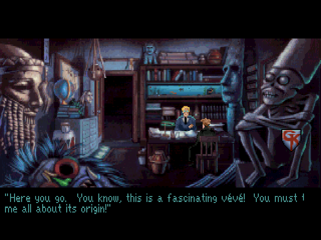
The fonts in GK1 aren't quite rendered right in ScummVM. The letters have inconsistent line widths and in some cases text is truncated.
The attached screenshot shows both of these problems. The lowercase e's in "Here" and "me" are rendered differently and neither has consistent horizontal lines. The word "tell" is truncated.
Also attached is a ScummVM save game at the scene of the screenshot. Turn on Text and show the professor the veve to trigger.
Attachments (2)
Change History (5)
by , 7 years ago
| Attachment: | gk1_font_scaling.png added |
|---|
by , 7 years ago
| Attachment: | gk1-cd.026 added |
|---|
comment:1 by , 7 years ago
comment:2 by , 7 years ago
| Owner: | set to |
|---|---|
| Resolution: | → fixed |
| Status: | new → closed |
Fixed in e4b8820762f10848205266c59bfcb80b2177e060.
(Oh, and the thing m-kiewitz said about the text display is correct. The SCI32 titles with low-resolution assets used a global scaling method so that low-resolution picture cels would align properly when scaled from 3:2 to 4:3. So, you will see sometimes the letters are drawn differently depending upon where on the screen they are drawn. This is unfortunate, but normal.)
comment:3 by , 7 years ago
I only played the original game, so long, loooong ago, in regular ol' DOS mode, so I never saw the original in hi-res VESA mode. If this is a pixel-perfect reproduction of that, then okay, but... the text is still ugly and a regression from the low resolution version.
This seems like an opportunity for ScummVM to improve upon a subtlety in the original, as it so often does. When a user throws their GKCD data files at ScummVM and accepts ScummVM's proposed defaults, as all normal users do, ScummVM takes on an obligation that those settings, such as high vs low resolution, are offering the better experience. As an ol' timey user familiar with regular DOS mode I noticed it immediately: the higher resolution items in the bookshop, the crisper menu, the map icons (even the blood sploch becoming crime scene tape), but despite being a stubborn bastard I accepted that while this was different than what I remembered it was generally better and I was quickly okay with it. (My first thought: why the hell does that magnifying glass in the bookshop look like a Windows 3.1 icon?)
Right now though, the default is to make text ugly. Text, much more than a few high-res gimmicks, permeates the entire game, especially if users turn text on for everything, which my 538 polling suggests they just MIGHT.
I understand the reason why it this way now, but I encourage a solution that makes it "right" out of the box. Otherwise, "text looks bad" is an argument for "just use DOSBox", and none of us want that.
All of this easy for the dude not implementing it say. =)
The "tell" is obviously an error in ScummVM,
but the "weird" scaling is also done in the original interpreter, when you start the game using hi-res VESA mode. I originally fixed this in our old guess-work code, but this one is properly reverse engineered, so it has the same issues that the original interpreter has.